Design
Posted By:
Lara McCormick
Friday 4 March 2011
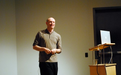
Jonathan Barnbrook spoke about his work, typography, and the role it plays, on February 23, 2011 at the Bumble & Bumble Auditorium.
Describing himself as a non-commercial designer, he began by discussing his ambition to use design as a weapon for social change. He introduced some of the work he did for Adbusters early in his career, and his role in developing the First Things First 2000 manifesto. Barnbrook also worked with David Bowie on the cover artwork for his 2002 album Heathen which featured the debut of his Priori typeface. He cited album cover artwork as one of the reasons he became a graphic designer.

The meat of his talk was “Why I continue to draw typefaces (and you should select them too).” Barnbrook’s fascination with typeface design is its connection to language, “language is always evolving, changing, so it makes sense that typefaces should too,” he said. One of the first faces he designed was a typeface to tell lies with, called Nixon, based on American car letterforms.
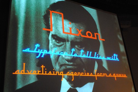
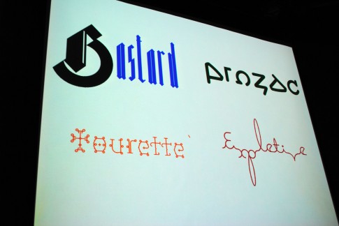
He stressed that when naming a font it is incredibly important that it “matches the poetry of language to the poetry of letterforms.”
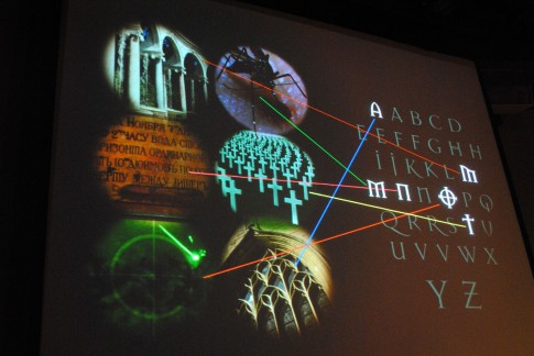
Recently inducted into MoMA, Barnbrook’s typeface Mason is his attempt to create beauty. Originally the font was called Manson named after the serial killer Charles Manson. Released by Emigré in 1992, the name upset so many people, it had to be changed. He explained some of Mason’s letterforms individually, in a slide with an image from his book. The ‘M’ inspired by the Palace of Versaille, the alternate ’M’ derived from insect-like forms, the ‘O’ a gun target.
In closing, he stated “we are creating new letterforms for humanity to express itself.”
For more information, visit:
Barnbrook’s Fonts
Adbusters
First Things First Design Manifesto 2000
To view event details, visit:
AIGA/NY Jonathan Barnbrook
To view additional photos, please visit our Flickr photostream. We encourage our members to contribute their photos to the AIGA New York Flickr group.