TUESDAY 8 JANUARY 2013 6:00–8:00PM
FREE SEMINAR:
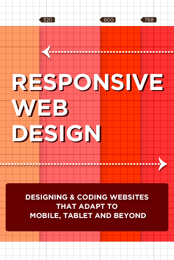
RESPONSIVE WEB DESIGN
Responsive Web Design
Designing & Coding Websites That Adapt to Mobile, Tablet and Beyond
The growing number of web consuming devices are challenging our design and development processes. In this seminar we will explore how techniques like responsive web design can help us rethink existing strategies, explore new options, and evolve so we can create websites that look great everywhere. Join us as we take a high level tour of the following subjects:
• The shortcomings of our current processes
• Thinking flexibly and using fluid layouts
• Tailoring experiences with media queries and feature detection
• Utilizing grid systems
• Flexible images and media
• Uncovering content issues
• The benefits of thinking mobile first
• Layering features with progressive enhancement
• Effects on workflow
• Maintaining content hierarchy across environments
• Testing and moving to code faster
This seminar is designed to introduce responsive web design techniques to designers and coders. There will be some examples of actual code, but many theoretical considerations. It will be useful and accessible for anyone involved in web design.
Click here for more information.
TIME AND PLACE
Tuesday 8 January 2013
6:00–8:00PM
Noble Desktop 594 Broadway, Suite 1202 New York, NY 10012
3:00-5:00PM Seminar OR 6:00-8:00PM Seminar

Comments