MONDAY 12 AUGUST 2013 6:00–8:00PM
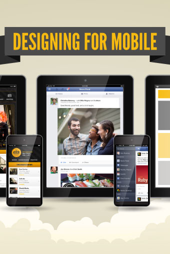
DESIGNING FOR MOBILE
A FREE SEMINAR FROM NOBLE DESKTOP
We don’t have to tell you that mobile devices have changed the computing landscape. An increasing number of people are browsing websites on smartphones and tablets, so they need to be mobile optimized. People are also using native apps specifically designed for smartphones and tablets. With these new devices come new design challenges that we’ll discuss in this seminar.
Join Noble Desktop for a 2-hour free seminar so you can become a better designer. Here are some topics that will be covered:
How Mobile is Affecting Logo Design
Navigation
∗ Small screens can be challenging. We’ll talk about and show examples of various styles of mobile navigation.
∗ Pros and cons of different types of mobile navigation.
∗ User experience and content flow. Considering what your users need to improve the experience.
Responsive Web Design
∗ Responsive websites are a single site that adapts itself across different sized screens (mobile, tablet, desktop, etc).
∗ Mobile First: Improve your designs by focusing on mobile devices first.
∗ Designing flexible content that can work across devices.
Emails
∗ Emails can be responsive too!
∗ How much can you do and what do you need to keep in mind?
How do I create my graphics/designs?
∗ What resolution & size should I work at?
∗ How to design for hi-res displays (Retina or HiDPI).
∗ Minimum button sizes that are ideal for tappable items.
∗ Previewing your designs live on devices while you work!
∗ Font considerations. How mobile fonts affect overall identity and print designs!
Guidelines for App Icons
∗ Common icon sizes for iOS & Android
∗ Templates for automating icon creation
Click here for more information.
TIME AND PLACE
Monday 12 August 2013
6:00–8:00PM
Noble Desktop 594 Broadway, Suite 1202 New York, NY 10012
3:00-5:00PM Seminar OR 6:00-8:00PM Seminar

Comments