Events
News & Updates
Posted By:
Irina Lee
Wednesday 2 March 2011
AIGA/NY Storytelling on the iPad: The Narrative Transcends the Linear event held at the Roy and Niuta Titus Theater 1, MoMA , on Tuesday, February 22, 2011.
The sold-out event featured presentations by Scott Dadich, Executive Director, Editorial Development of Digital Editions at Condé Nast, Gael Towey, Chief Creative and Editorial Director for Martha Stewart Living, and Nicholas Callaway, Chief Creative Officer at Callaway Digital Art.
Scott Dadich began his presentation by defining a digital magazine as the intersection between technology, reporting and design and posing a question of “how do these form factors take shape in the next months and years?” he said.
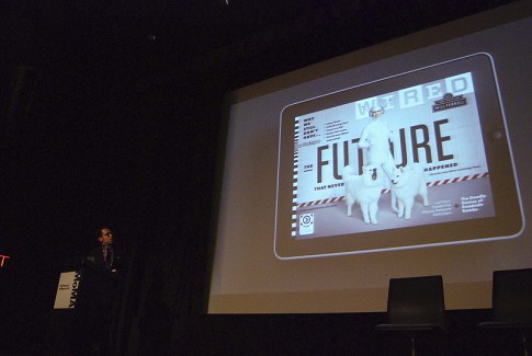
In 2009 Wired magazine went into an intense partnership and collaboration with Adobe to power the tablet edition of the magazine as well as the rest of the Conde Nast publications.
The design team had to invent an entirely new workflow around a complicated process, while keeping the magazine’s voice, passion, and a special connection to the reader.
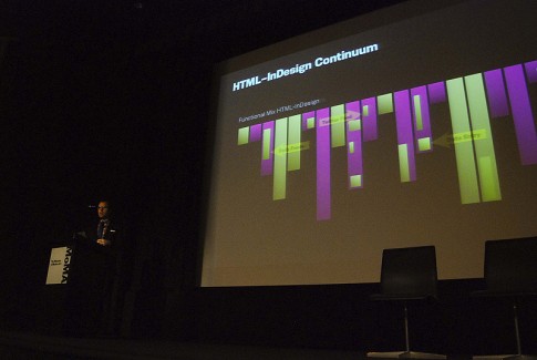
The collaboration with Adobe enabled the Wired design team to adapt their current tools, layouts, typography and photography for the tablet screen. Instead of creating HTML templates and dropping a PDF into the tablet, the team created an enhanced digital version with the same authoring and design tools. The outcome from the collaboration was a dual-channel output, “where we can create a print layout and a digital experience on the same desktop with the same design team, in the same brains, the same editing, the same curation, the same voice,” Dadich said.
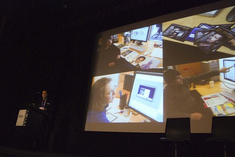
The tablet edition of Wired magazine opened new avenues for storytelling. For example, the June 2010 digital issue featured an interactive map of Mars. Tablet readers were able to interact with a custom planet app where touch points and flags allowed readers to rotate the planet, explore, and dive into photographs of the planet from NASA altitude maps.
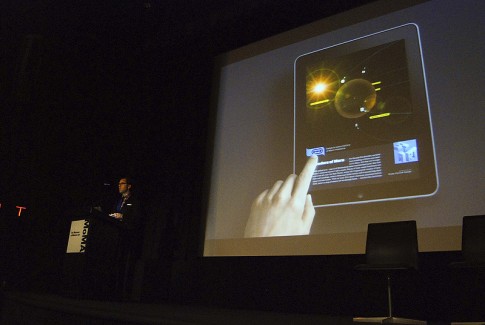
“You can see how storytelling changes when it gets on a device where it’s not just analog. We’re trying to conceive of stories that want to be told in this medium and communicated in different kind of voice,” said Dadich.
In addition to expanding and refining its approach to feature stories, the digital version of Wired magazine includes motion covers. The September 2010 tablet issue featured an exclusive cover video and short films starting actor Joel McHale. McHale attempts to introduce the cover story, but he interrupts himself as he jokes about how long it takes to download the app. “We’re thinking about covers differently. It’s not just a photo shoot. It’s performance: there’s script writing, pre-production meetings with the cover talents, conceptualizing, video editing, and After Effects,” said Dadich.
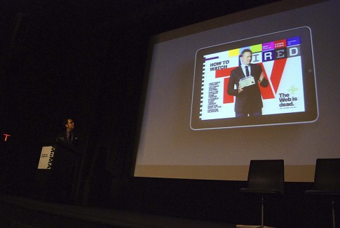
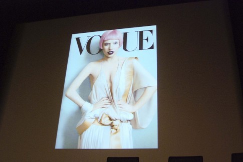
Scott concluded his presentation with never-before-seen previews of digital platforms from Vanity Fair, GQ, Glamour and Vogue.
Next, Gael Towey presented how Martha Stewart Living approached the transition from print to tablet. The idea of “creating one issue that would be our experimentation, started with the 20th anniversary of our magazine,” said Towey, “we needed to experiment, create our templates, and not feel that we were on a monthly deadline.” Collaborating with Adobe, the team created the Boundless Beauty special edition for the iPad that was released in November 2010.
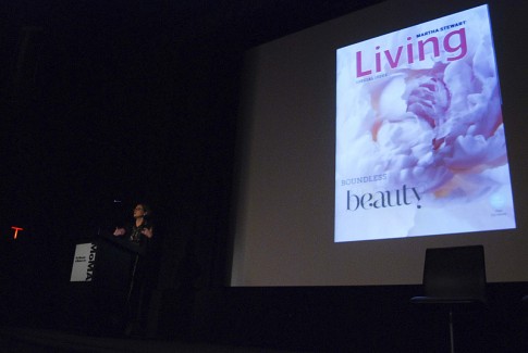
In order to integrate the process of magazine and story development, every single designer and editor on the team wrote a story for the special issue. Involving “the people who were actually going to execute [the digital issue] and bring it forward was really essential,” said Towey.
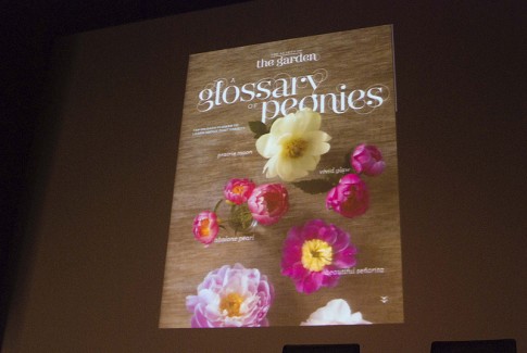
The idea of experiencing transformation was a driving factor for the special issue. The live cover featured a beautiful blooming peony created from 180 photographs taken over a 10-hour period.
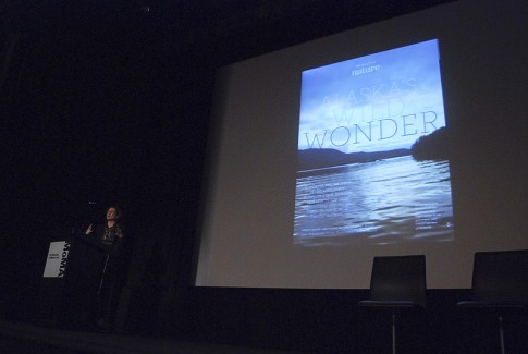
Gael Towey showed featured stories of an Alaskan narrative with immersive photography, panoramic photographs of Martha Stewart’s garden, step-by-step “how to” slideshows, make-up “before and after”, and many more.
Gael Towey also showed the February issue of Everyday Food, and her favorite part, the video component of the section called What’s for Dinner Tonight?.
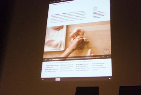
“There’s something incredibly straightforward about being able to see how something is being done because it seems so easy and comfortable that it makes you want to do it in a way that pictures do not answer,” Towey said.
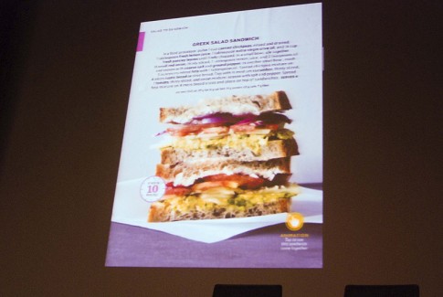
One big decision after much consideration was to make the tablet edition available only in one direction.
“There’s an enormous amount of work involved in laying out the magazine as a print product, and then laying it out again in two directions as a digital product. The decision was made [to offer the tablet edition in one direction] so that everybody can concentrate on creating content, not just reorganizing it in different directions,” said Towey.
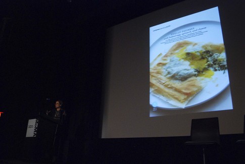
She highlighted additional video and interactive content that walks the readers through simple recipes. Gael Towey concluded by saying that the iPad edition makes the magazine even more functional than it already is, “it’s that sense of transformation and having fun—it’s so easy, it makes you want to do it. The whole brand values of the magazine are really embedded in the way that it works.”
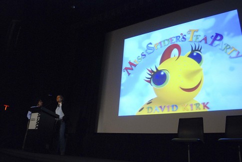
The last presenter, Nicholas Calloway, shared his journey from book publishing to app publishing, and his experimentation of using the iPad as a publishing platform. Taking his well-known children’s book, Miss Spider’s Tea Party, the team of Calloway Digital Arts created an interactive iPad book. The digital book is rich with activities like games, puzzles, painting, matching and animation of the full story.
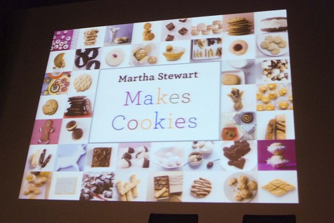
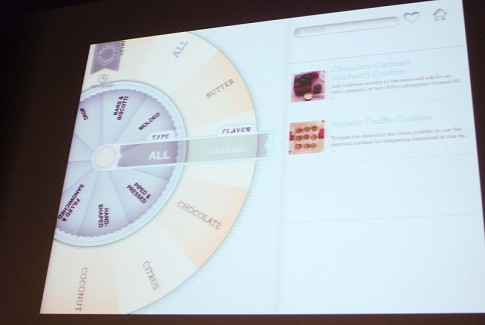
He showed his collaboration with Martha Stewart Living Omnimedia to create the Martha Stewart Makes Cookies app. The app includes recipes that can be searched by type, flavor and texture using the roulette-wheel-style recipe finder.
Additional features include a built-in timer, the ability to email ingredients and share your favorite cookies via social networks and how-to videos.
He also shared his lessons learned, “first lesson is how much I don’t know, the second lesson is how I have to unlearn so many things that I thought to be true as first principles from the print world. There are very few paradigms to bring to this new world from the old world with one exception: good design is good design,” he said.
So what defines good design in the tablet medium? The tablet user experience involves the best of graphic design, print, typographic design, web design, photography, writing, editing, still imagery, moving imagery, animation and of course UI and UX, and it’s all driven by what is possible technologically at this moment, which is changing by the day. “We’re only at the beginning of an amazing new era,” he said.
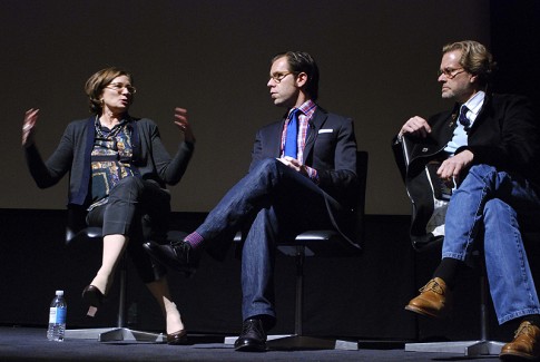
A panel discussion concluded the event.
For more information, visit
Wired Magazine for iPad
Martha Stewart Living for iPad
Martha Stewart for iPad
Miss Spider’s Tea Party for iPad
Callaway Digital Arts
To view event details, visit
AIGA/NY Storytelling on the iPad: The Narrative Transcends the Linear
To view additional photos, please visit our Flickr photostream. We encourage our members to contribute their photos to the AIGA New York Flickr group.