Design
Posted By:
Lara McCormick
Wednesday 6 April 2011
The AIGA/NY MoMA Embraces Typography event held at the Celeste Bartos Theater, MoMA, on Monday, March 28, 2011
The sold-out event began with a presentation by Paola Antonelli, curator of Architecture and Design at MoMA.
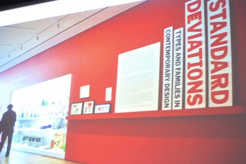
The acquisition of 23 digital typefaces by MoMA for its Architecture and Design Collection marks a major milestone in typography. Standard Deviations is the exhibition which features these typefaces. The exhibition has samples of the typefaces, their standard alphabets repeated at different sizes, and quotes that have to do with the typefaces. A glossary and videos are included, with designers explaining their role.

The distinct group of typefaces that are included in the collection took a long time to distill. The typefaces are OCR-A (the first typeface to be read by machines), New Alphabet, Bell Centennial, ITC Galliard, FF Meta, Oakland, Keedy Sans, FF BEOWOLF, Template Gothic, Dead History, HTF Didot, FF Blur, Mason, Mantinia, Interstate, Big Caslon, FF Din, Walker, Verdana (the only typeface in the collection design for the screen), Mercury, Miller, Retina, and Gotham.
This is just the beginning; MoMA intends to continue, with hopes that it will be a new branch of the MoMA collection.
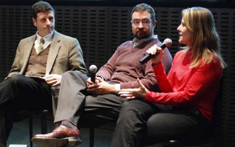
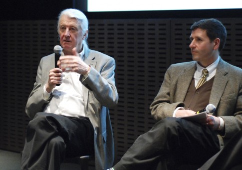
Moderated by Charles Nix, Chairman of the Board of the Type Directors Club, The panel discussion began. On the panel, Paola Antionelli, Matthew Carter, and Jonathan Hoefler.

Why Typefaces, Why now?
PA: Why now? It takes time. Machine art began in 1934. Typefaces are a part of this, part of masterpieces that MoMA has been acquiring for 80 years.
Jonathan, did you have any idea when you were creating Gotham that it would become this popular?
JH: Gotham was everywhere already, in signage like the port authority sign. It was already ubiquitous with New York. This made our job easy.
Paola, how did you stop with 23 typefaces?
PA: to make a group heavy, you have to make it small. We ended up with this number from the selections that we had.
Paola, you have 23 names, what about the family members? The various weights? Where do you stop?
PA: We are trying to acquire all the families. We acquired all the licenses for these.
Jonathan & Matthew, from a designer’s standpoint, what was it like to have your typefaces acquired?
MC: We had to sign some things, MoMA asked for the whole family.
JH: We had to ask the question what constitutes a font? We are still working on Gotham, which now has 66 styles, and is still being refined.

Jonathan, Matthew, are there typefaces you would like to add to the included 23?
MC: If I had been in Paola’s shoes, it might have been a different selection but I can’t really say. I don’t have any problem with the selection. I would consider Thesis and Meridian.
JH: I wouldn’t mind Charter being included.
Verdana is the only typeface in the collection that is meant to be used on screen. Are you designing primarily for print now, or web and screen?
JH: We are doing both. A font designed for print is not the same as one designed for the screen. It’s a new medium.
MC: I’m still working with Microsoft on a screen font project. I think you have to be prepared for the fact that type will be used in both mediums.
Which of your faces in the collection is your favorite?
JH: Retina is unfinished, so I have a love/hate relationship with it. It’s still intriguing, so I’d have to say that one.
MC: I don’t have a favorite. What I react to is the use of a typeface.
The floor was then opened to audience questions.
For more information, visit:
MoMA’s Exhibition, Standard Deviations: Types and Families in Contemporary Design
Matthew Carter
Jonathan Hoefler
To view event details, visit:
AIGA/NY MoMA Embraces Typography
To view additional photos, please visit our Flickr photostream. We encourage our members to contribute their photos to the AIGA New York Flickr group.